


Accelerating Growth With Analytics 3
Once users are activated, the next goal is to increase the intensity and frequency of their actions, aka higher engagement levels. This could be to watch more videos, swipe more on dating apps, or buy more products etc.
Behavioural Analysis
To increase the level of engagement, you first need to understand 1) your active users and how they currently behave, and 2) what factors influence or prevent desired behaviours.
From Vanity to North Star Metrics
When snapshotting user behaviours, you first need to define an active user and how to measure engagement levels. An active user could be someone who opened the app, someone who read an article, or someone who made a purchase. Whatever the definition, the key is to standardise it within your organisation so everyone goes by the same terminology. We recommend keeping a Data Dictionary with both business and technical definitions that is updated and published as it evolves with your business.
Be Careful of Vanity Metrics
Many startups report on Daily Active Users (DAU) or Monthly Active Users (MAU) as the most important KPIs. When you are just starting off, these can be good indicators of early growth and user adoption. However, these vanity metrics have fallbacks. We say ‘vanity’ because they might make you feel good but do not always reflect on the true health of your business. Say you are a streaming service and just launched an aggressive email campaign to reactivate dormant users, but without substantial improvement to your underlying service. You might see a step jump in DAUs but no real impact on business bottomline, e.g. subscribers or retention.
Stickiness
Some choose to track DAU/MAU ratio, aka stickiness. A 50% DAU/MAU ratio suggests on average users are active 15 days in a month. This is a good indication of average usage frequency especially examined over time. The downside is that, well, it is an average. It hides important nuances of your user behaviour.
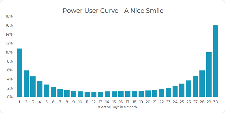
Power User Curve
A user curve visualises usage frequency in the form of a histogram. It shows the percentage of users by the total number of active days in a month. You can choose other metrics that better reflect the health of your business, e.g. total number of swipes or views in a month. You can use a different time period if your product has a different usage cycle such as weekly. You can also use the power user curve to evaluate a particular feature, e.g. the number of times users shared playlist in chats.
Power users refer to those who are the most active, e.g. more than 25 active days in a month. They sit in the last bars on the right of the histogram and are the most desired users. Ideally you would like to move everyone further to the right. Below is a power user curve with a very nice right-leaning smile aka a group of very sticky users who come back almost everyday.
From the power user curve you can segment your users into different categories and start comparing them for deeper insights. For example, which feature your power users return to the most? Are one-day users aware of or fully understand the benefits of this feature?
Aha! Moment
Power user curve can help you discover your Aha! Moment. Aha! is the lightbulb moment when users realise the value of your product or service. Ideally you want this moment to happen as early as possible.
So how to identify what factors trigger the eureka moment? One way is to model the pairwise correlation between a list of behavioural metrics and the power user metric, e.g. number of active days. The idea is to discover what type of behaviour links to higher engagement levels and encourage this behaviour early.
You might also find behaviours that correlate negatively with engagement levels, e.g. number of referral or payment hooks. These hooks tend to disrupt natural usage and can be an annoyance to customers. The key is to determine the right moment and the maximum amount of times you serve them.
North Star Metric
From the Aha moment, you can tailor your own north star metric that guides your growth effort. For example, Facebook learnt from historical data that users who added 7 or more friends in the first 10 days were more likely to be retained in the long-term. The growth team can then use this metric instead of a simple vanity metric like the number of new users.
User Segmentation
Once you gain some understanding of your customer behavior and the key influencers, you can start segmenting them and design more personalised experiences. We are more likely to be engaged when we receive contents or products tailored to our current situation or preference. This is why recommender systems work particularly well in upselling.
As a company, if you have a handful of VIP customers, it is not difficult to look up individual details and purchase history in order to tailor their experiences. But when you cater for hundreds of thousands of users, this approach is no longer practical. This is where user segmentation comes in the picture.
The idea is to group users that exhibit similar characteristics together and design solutions for each group based on their commonalities. There are many ways we can segment a user: their geolocations, tastes, preferences etc. We can generalise into three categories: demographic, psychographic and behavioural data.
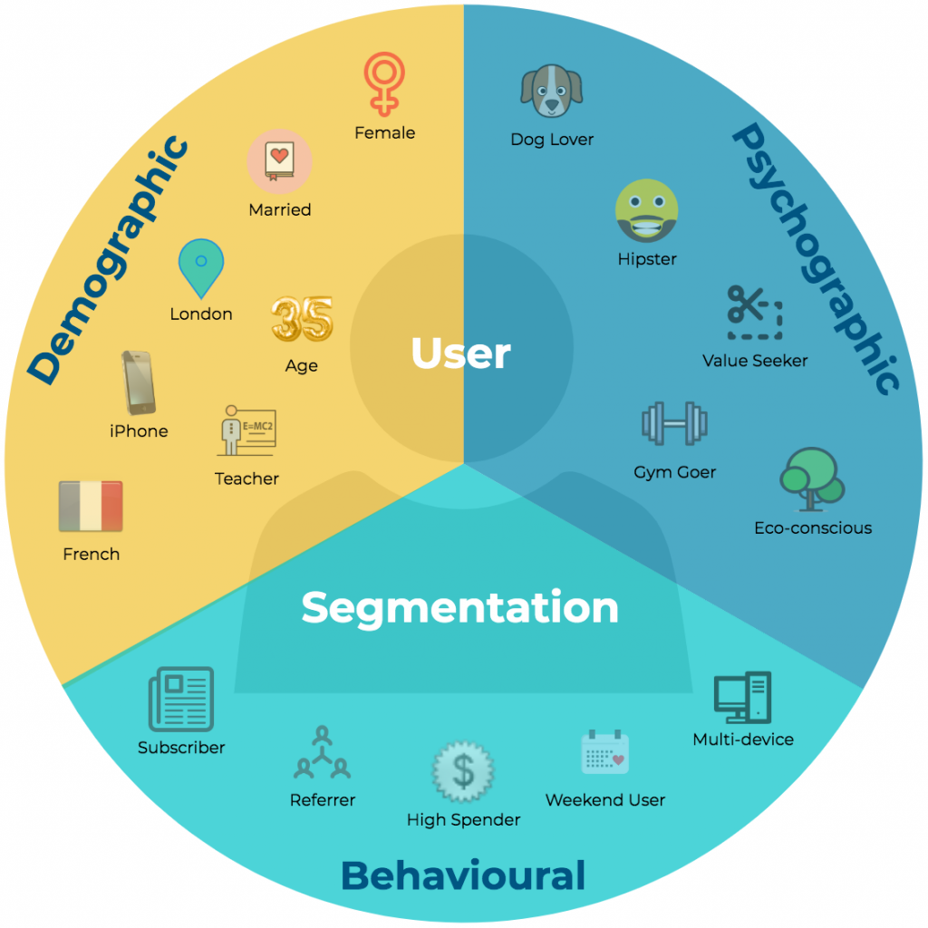
Demographic Segmentation
This relates to who your users are ‘on paper’, aka factual characteristics of a person. Nationality, country of residence, age group, gender, marital status, everything you see on census statistics.
Psychographic Segmentation
If you consider demographics as the quantitative study of a population, psychographic is its qualitative counterpart. It relates to users’ beliefs, values, traits, hobbies etc. This type of information could be very useful when tailoring marketing materials for user acquisition. For example, if you are in the business of recycled goods, you may want to target people who are more eco-conscious. To better convert value seekers, you might want to give out discount codes.
Behavioural Segmentation
Behavioural data covers everything relating to how users engage with your products and services — types of actions, frequency, recency, intensity, monetary values and other characteristics. Below is an example of behavioural segmentation of a freemium model that maps out all user states as they go through their lifecycle. The arrows represent potential transitions from one state to future states.
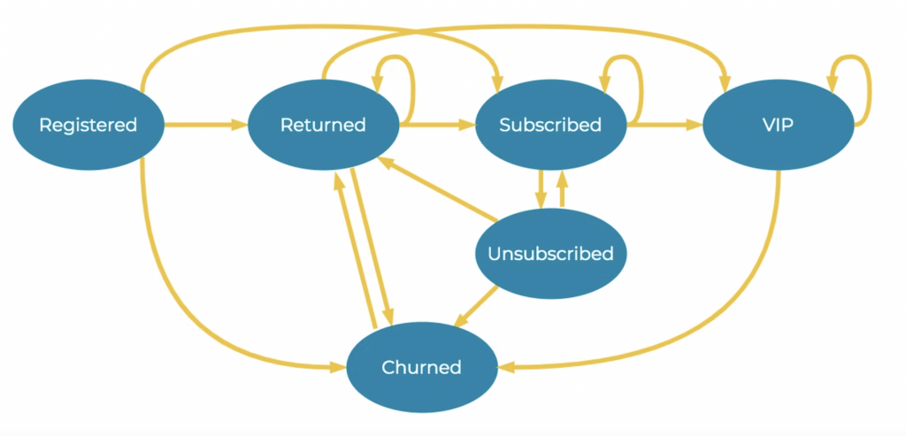
Registered: users that newly registered on your platform. You may define ’new’ based on your business model, e.g. time based on day of registration or action driven such as before a certain action or a mixture of both. You may also derive this from behavioural studies.
Returned: registered users who returned to your platform. This could be daily or weekly or after a period of inactivity, again based on the nature of your business and historical behaviour analysis.
Subscribed: users who subscribed to your service.
Unsubscribed: subscribed users who cancelled their subscription.
Churned: users who stopped using your service. Historical analysis should help you define ‘churn’, e.g. 14 days inactive.
VIP: this is your most desired customer group. They could be subscribers who are also brand champions and referred your products to many others. Or super loyal subscribers, e.g. over X years. Examining your own data will help you refine this definition.
In the example, we modelled all user segments into a Markov chain, aka a series of possible states and the flow among them. You can design treatments that encourage the positive flows between user states, e.g. from returned to subscriber. You can also calculate the probability of each state transitioning to another and use it to simulate your financial models and predict usage or churn.
Above is just one of the many ways to segment your users. The model becomes more powerful when you overlay multiple segmentations together. For example, you may add geographic segmentation and unique selling point (USP) segmentation.