
We published our data salary review and got enough questions about how we built it that it seemed worth writing up properly. Here are six lessons from putting a data product together end to end, including a few decisions we would make differently and one we definitely would not.
Start with the end in mind
This is perhaps the most obvious thing we could say, and yet it is the step we most often see skipped when working with clients. Before a single line of code is written or a single row is scraped, you need to know who the product is for and what you want them to do with it.
For internal data initiatives, that means thinking clearly about who your stakeholders are, what decisions they can actually make based on the data, and what behaviours you want to encourage. There is no point extracting everything and building something nobody uses. The minimum data that gets you to a useful answer is almost always better than the most comprehensive dataset you could theoretically assemble.
For an external-facing data product, it is even more important. You need to know your audience, the purpose of the thing, and how it should look and feel before you start building.


In our case, 173tech is a data agency. We help companies extract, model, and centralise their data. But data leaders who already have in-house teams can be cautious about bringing in an agency. They worry you are there to land and expand, to make yourself indispensable, to quietly make the case that their team is not good enough. None of that is true in how we operate, but the perception exists.
So we needed something more neutral. A soft, top-of-funnel introduction to who we are, with a bit of email capture. The salary review does two things commercially: it helps data professionals benchmark what they are being paid, and it helps companies benchmark the cost of hiring in-house versus using an agency like us. That is a commercial frame, not a vanity piece.
The product itself was designed around comparison: locations, experience levels, roles, and years. Something simple enough that a non-technical person could use it without needing a tutorial.
Expert help is only a call away. We are always happy to give advice, offer an impartial opinion and put you on the right track. Book a call with a member of our friendly team today.
Data collection is 20% of the work
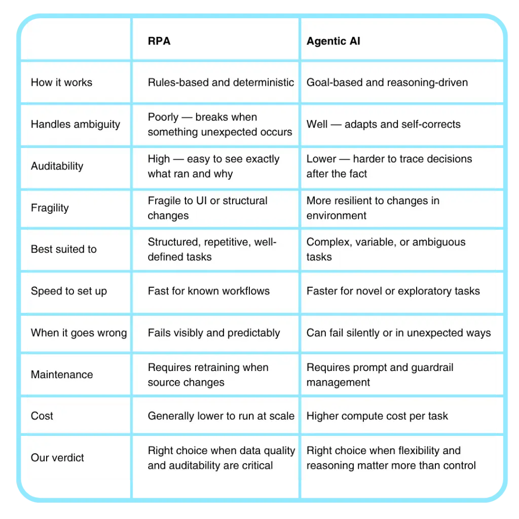
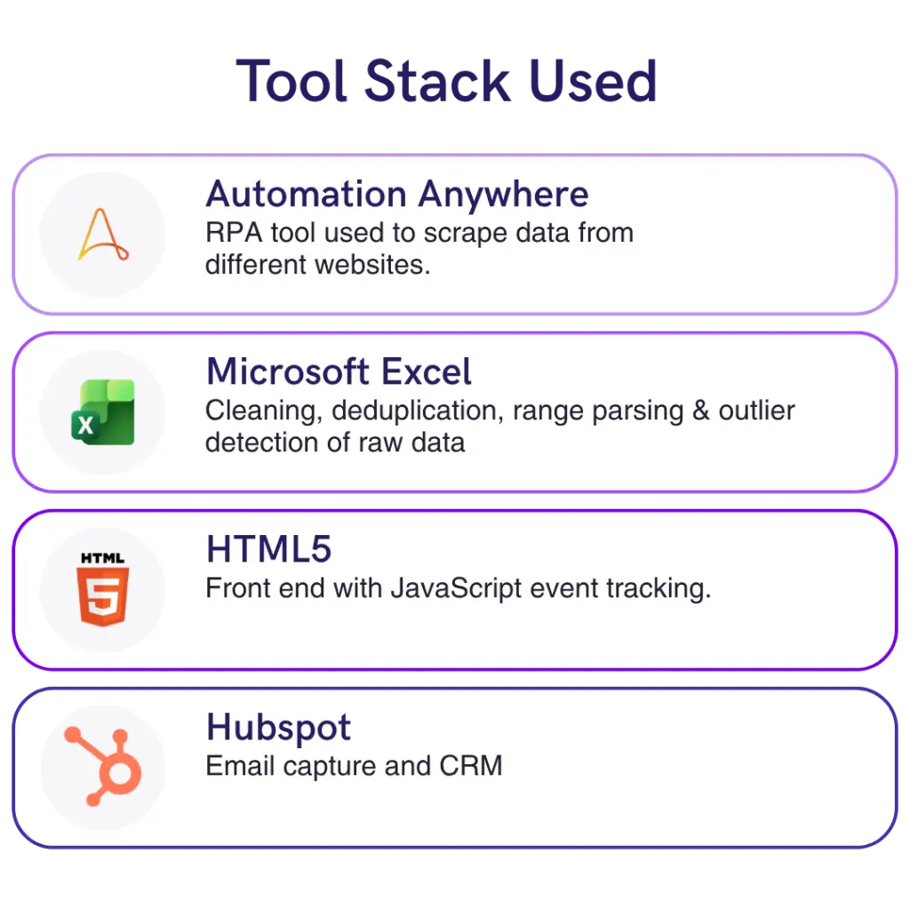
We scraped data from eleven different job sites using RPA, robotic process automation, rather than an agentic approach. We know the technology well and it was the right tool for structured extraction where auditability mattered. But it is worth explaining the difference, because a lot of tools are being marketed as agentic that are really just RPA under the hood.
RPA is rules-based and deterministic. If this happens, do that. Follow this exact script. The advantage is that it is easy to audit and well suited to structured extraction. The disadvantage is that it is fragile to UI changes. If the download button moves, the robot breaks.
Agentic AI is goal-based. It reasons, adapts, and self-corrects. It handles ambiguity better, but it is harder to predict and harder to audit after the fact. For a project where data quality was critical, RPA was the right call.
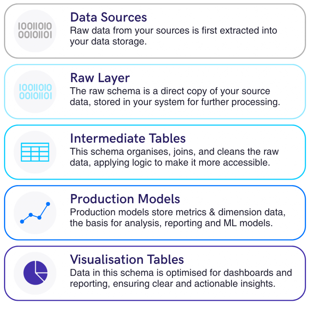
Here is the thing though: scraping the data was a few days of work. The main bulk of the project, as with any data project, was cleaning, structuring, and validating what came back. That is always the hard part.
The first problem was that roughly 60% of job adverts had no salary listed at all. Of those that did, most gave a range rather than a point figure. That introduces a compounding problem: you are averaging the midpoints of ranges, which means you are averaging averages. There is a statistical trap in there around variance compression and skewed distributions, but with enough postings those errors tend to cancel each other out and the central estimate becomes reliable.
For the jobs with no salary listed, we filled a lot of the gaps using Glassdoor. In the end, we had no reference point at all for roughly 20% of advertised roles, and for those we used the averages already established from everything else.
The second problem was coverage. Not every city had enough job postings to be statistically meaningful. We ended up with 23 cities across six countries, driven by coverage rather than ambition. The UK and the US were the primary focus, but we also included Germany, France, the Netherlands, and Canada where the data was robust enough.
The third problem was geographic boundaries. A lot of postings that say “New York” mean New York State. A lot that say “London” mean Greater London rather than the City. In most cases it was cleaner to use the broader area. Los Angeles was a particular outlier: it is one of the biggest tech hubs in the world, but a significant number of postings carried salaries that did not hold up when cross-referenced against Glassdoor. We used California as a whole state rather than the city for that reason.
Once the data was extracted to raw Excel, we went through the full modelling process manually: cleaning, deduplication, range parsing, currency normalisation, and outlier detection. Normally this sits in a staging layer in a data warehouse. Here it sat in a spreadsheet. Sometimes the right tool is the simplest one.















































Currency can get complicated
We standardised everything to US dollars to make cross-market comparison straightforward. But exchange rates move, and a one-off data product does not have the luxury of a live exchange rate feed. We averaged rates over the previous year to find a relatively stable inflection point across currencies. Next year we will likely present figures in native currency alongside dollars. It makes the product more useful for people who are not naturally thinking in USD.

The interface decision
We built the interface in HTML5 rather than using a dashboard tool, and it was more painful than it needed to be.
The main reason was tracking. This product sits at the top of the funnel. People are not going to log in. Many will not give you an email address. But we wanted to know which locations people were looking at, how they navigated the product, and which parts they spent time on, because it would inform what to include next year. Building in HTML5 with JavaScript event tracking gave us that. If someone gives us their email address, we can link their behaviour to that identity. HubSpot handles the email capture and the CRM integration.
The secondary reason was branding. We care about how things look, and dashboard tools have constraints around fonts, colours, and layouts. We wanted large text, clean design, and something a non-technical person could pick up immediately.
The trade-off is that going bespoke means building everything from scratch. Our team could have had a dashboard live in half a day. The custom build took considerably longer.
Would we use AI next time?
Probably yes, at least as a first attempt. Tools like Lovable can get you to something working quickly, and for a project where speed matters more than tracking granularity, that trade-off is likely worth making.
Our hesitation is with complexity. When you have five or six pages that all need to link back to each other, with conditional navigation and a specific UX flow, AI does not always get that right. You can spend a couple of days going back and forth and end up with something fragile.
But by the time we build the next iteration, we will certainly try AI first. If we cannot get somewhere useful within a few hours, that tells us it is not the right fit for that particular build. The reason we went custom this time was straightforward: we were comfortable with the tools, we needed a level of event tracking we were not confident an AI-built product would deliver without significant additional work, and this was a project built on the side in December. Sometimes the right tool is the one you already know.

Build limitations in deliberately
The salary data product is static. It is based on a full year of job postings, and that is entirely intentional.
A live dashboard that updated daily would be technically possible. It would also be more expensive to run, harder to maintain, and arguably less useful. This product is designed to be a yearly touchpoint, something people check when the new review comes out, something that gives us a reason to get back in front of our network each year. A live product does not serve that purpose.
There is also the question of where you put the barrier. The comparison data, the full rankings, and the downloadable report sit behind a light email capture. Not a paywall, not a full signup wall, just a name and an email. The product itself is free to use.
Deciding where to put that barrier is one of the hardest questions in building any data product. What are people willing to exchange their contact details for? What is genuinely valuable enough that someone will take an action to get it? We do not have a clean universal answer, but we will say this: if nobody in a given location downloads the data next year, that location probably does not make the cut next time.
The six lessons
One: define the audience and the purpose before a single line of code is written. Everything else follows from that.
Two: data collection is a small fraction of the work. Cleaning, structuring, and validating is where you actually spend your time. Do not underestimate it.
Three: data refresh cadence depends on the end outcome. More live is not always more useful.
Four: currency normalisation needs a decision and a methodology. Average rates over a meaningful period rather than picking a single point in time.
Five: it is fine to choose tools you are comfortable with. AI is genuinely useful but it is not always the right answer, and knowing when not to use it is its own skill.
Six: build limitations in deliberately. Think about where you want people to take an action, and make that part of the product design from the start.
If you have got questions, drop them in the comments. We are happy to go into more detail on any of it.
